
1.首页制作
1.1 main 主体模块制作
以前书写的就是模块化中的公共部分。
main 主体模块是 index 里面专有的,注意需要新的样式文件 index.css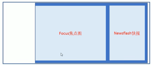
- main 盒子宽度为 980 像素,高度是455像素,位置距离左边 220px (margin-left ) ,给高度就不用清除浮动
- main 里面包含左侧盒子,宽度为 721像素,左浮动,focus 焦点图模块
- main 里面包含右侧盒子,宽度为 250像素,右浮动,newsflash 新闻快报模块
css
.main {
    width: 980px;
    height: 455px;
    background-color: pink;
    margin-left: 220px;
    margin-top: 10px;
}
.focus {
    float: left;
    width: 721px;
    height: 455px;
    background-color: purple;
}
.newsflash {
    float: right;
    width: 250px;
    height: 455px;
    background-color: skyblue;
}
html
<!-- 首页专有模块 main模块 -->
      <div class="w">
        <div class="main">
            <div class="focus">

            </div>
            <div class="newsflash">

            </div>
        </div>
      </div>
1.2 左侧focus模块制作

- 大的 focus 盒子 包裹 1 号展示图片的盒子,2号 3号 左右箭头的盒子,4号 小圆点的盒子
html
<div class="focus fl">
	<a href="#" class="arrow-l"> < </a>
	<a href="#" class="arrow-r"> > </a>
	<ul>
		<li>
		  <a href="#"><img src="upload/focus.jpg" alt=""></a>
		</li>
	</ul>
	<ol class="circle">
		<li></li>
		<li class="current"></li>
		<li></li>
		<li></li>
		<li></li>
		<li></li>
		<li></li>
		<li></li>
	</ol>
</div>- 包裹 1 号盒子(
ul > li > a > img),轮播图这样的布局是为了后面方便配置js逻辑代码 - 2 号盒子 跟 3 号盒子 左右箭头,利用定位的方式来实现
css
.arrow-l,
.arrow-r {
	position: absolute;
	top: 50%;
	margin-top: -20px;
	width: 24px;
	height: 40px;
	background: rgba(0, 0, 0, .3);
	text-align: center;
	line-height: 40px;
	color: #fff;
	font-family: 'icomoon';
	font-size: 18px;
}
.arrow-r {
	right: 0;
}- 4 号盒子 里面放 小圆点 (
ol > li)- 小圆圈利用边框实现
- 小圆点里面背景颜色来实现
css
.circle {
	position: absolute;
	bottom: 10px;
	left: 50px;
}
.circle li {
	float: left;
	width: 8px;
	height: 8px;
	/*background-color: #fff;*/
	border: 2px solid rgba(255, 255, 255, 0.5);
	margin: 0 3px;
	border-radius: 50%;
	/*鼠标经过显示小手*/
	cursor: pointer;

}
.current {
	background-color: #fff;
	box-shadow: none;
}
1.3 右侧newsflash模块制作
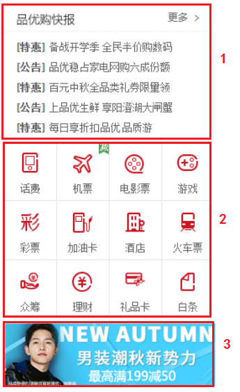
- 右侧的模块 分为上中下三个盒子
html
<div class="newsflash">
    <div class="news">
        ...
    </div>
    <div class="lifeservice">
        ...
    </div>
    <div class="bargain">
        ...
    </div>
</div>
1 号盒子为
news新闻模块 高度为 165px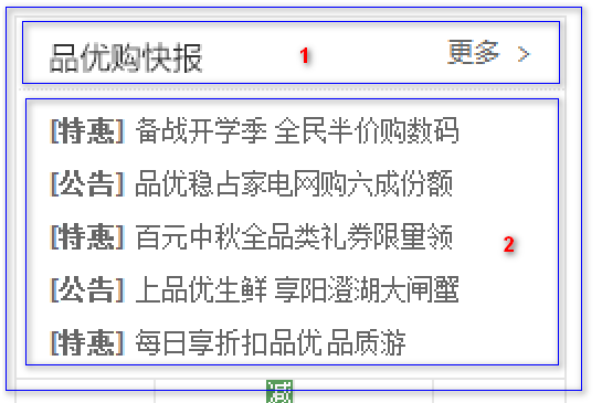
- 分为上下两个结构,但是两个模块都用 div,上面是
news-hd,下面是news-bd
- 分为上下两个结构,但是两个模块都用 div,上面是
html
<div class="news">
    <div class="news-hd">
        ...
    </div>
    <div class="news-bd">
        ...
    </div>
</div>
css
.news {
   height: 165px;
   border: 1px solid #e4e4e4;
}- 上面是
news-hd,设置高度是 33px,设置下边框- 里面放一个
h5标题 - 放一个a
标签,内容是 更多,然后让a进行右浮动,三角用伪元素设置字体图标就好
- 里面放一个
html
<div class="news-hd">
    <h5>品优购快报</h5>
    <a href="#" class="more">更多</a>
</div>
css
.news-hd {
    height: 33px;
    line-height: 33px;
    border-bottom: 1px dotted #e4e4e4;
    padding: 0 15px;
}
.news-hd h5 {
    float: left;
    font-size: 14px;
}
.news-hd .more {
    float: right;
}
.news-hd .more::after {
    font-family: 'icomoon';
    content: '\e920';
}- 下面是
news-bd- 里面包含
ul和li还有链接 - 给
li设置高度,24px,设置单行文字溢出省略: 1. 设置overflow: hidden;2.设置white-space: nowrap;3. 设置text-overflow: ellipsis;
- 里面包含
html
<div class="news-bd">
    <ul>
        <li><a href="#"><strong>[重磅]</strong> 它来了它来了,pink老师走来了, 它是谁?</a></li>
        <li><a href="#"><strong>[重磅]</strong> 它来了它来了,pink老师走来了</a></li>
        <li><a href="#"><strong>[重磅]</strong> 它来了它来了,pink老师走来了</a></li>
        <li><a href="#"><strong>[重磅]</strong> 它来了它来了,pink老师走来了</a></li>
        <li><a href="#"><strong>[重磅]</strong> 它来了它来了,pink老师走来了, 它是谁?</a></li>
    </ul>
</div>
css
.news-bd {
    padding: 5px 15px 0;
}
.news-bd ul li {
    height: 24px;
    line-height: 24px;
    overflow: hidden;
    white-space: nowrap;
    text-overflow: ellipsis;
}
2 号盒子为
lifeservice生活服务模块 高度为 209px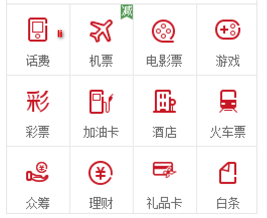
- 设置边框(左右下 边框)
- 里面的内容 是
ul > 12*li,给li设置宽 63px,高71px,设置 右边和下边的边框,设置浮动 - 这样设置后,第四个li会装不开,掉下来,解决办法如下
lifeservice盒子宽度为 250 ,但是装不开里面的 4 个小 li- 可以让
lifeservice里面的ul宽度为 252,就可以装的下 4 个 小 li lifeservice盒子 overflow 隐藏多余的部分就可以了
- 在
li里面放一个i(O里面放图标),下面的文本用p标签包裹 - 给
i设置 24px宽和28px的高(注意i是行内元素, 转成行内块),给li设置text-align:center让里面内容居中显示
html
<div class="lifeservice">
    <ul>
        <li>
            <i></i>
            <p>话费</p>
        </li>
        <li>
            <i></i>
            <p>话费</p>
        </li>
        <li>
            <i></i>
            <p>话费</p>
        </li>
        <li>
            <i></i>
            <p>话费</p>
        </li>
        <li>
            <i></i>
            <p>话费</p>
        </li>
        <li>
            <i></i>
            <p>话费</p>
        </li>
        <li>
            <i></i>
            <p>话费</p>
        </li>
        <li>
            <i></i>
            <p>话费</p>
        </li>
        <li>
            <i></i>
            <p>话费</p>
        </li>
        <li>
            <i></i>
            <p>话费</p>
        </li>
        <li>
            <i></i>
            <p>话费</p>
        </li>
        <li>
            <i></i>
            <p>话费</p>
        </li>
    </ul>
</div>
css
.lifeservice {
    overflow: hidden;
    height: 209px;
    /* background-color: purple; */
    border: 1px solid #e4e4e4;
    border-top: 0;
}
.lifeservice ul {
    width: 252px;
}
.lifeservice ul li {
    float: left;
    width: 63px;
    height: 71px;
    border-right: 1px solid #e4e4e4;
    border-bottom: 1px solid #e4e4e4;
    text-align: center;
}
.lifeservice ul li i {
    display: inline-block;
    width: 24px;
    height: 28px;
    background-color: pink;
    margin-top: 12px;
    background: url(../images/icons.png) no-repeat -19px -15px;
}- 3 号盒子为
bargain特价商品- 这个比较简单,直接插入一张图片即可
html
<div class="bargain">
    <img src="upload/bargain.png" alt="">
</div>
css
.bargain {
    margin-top: 5px;
}